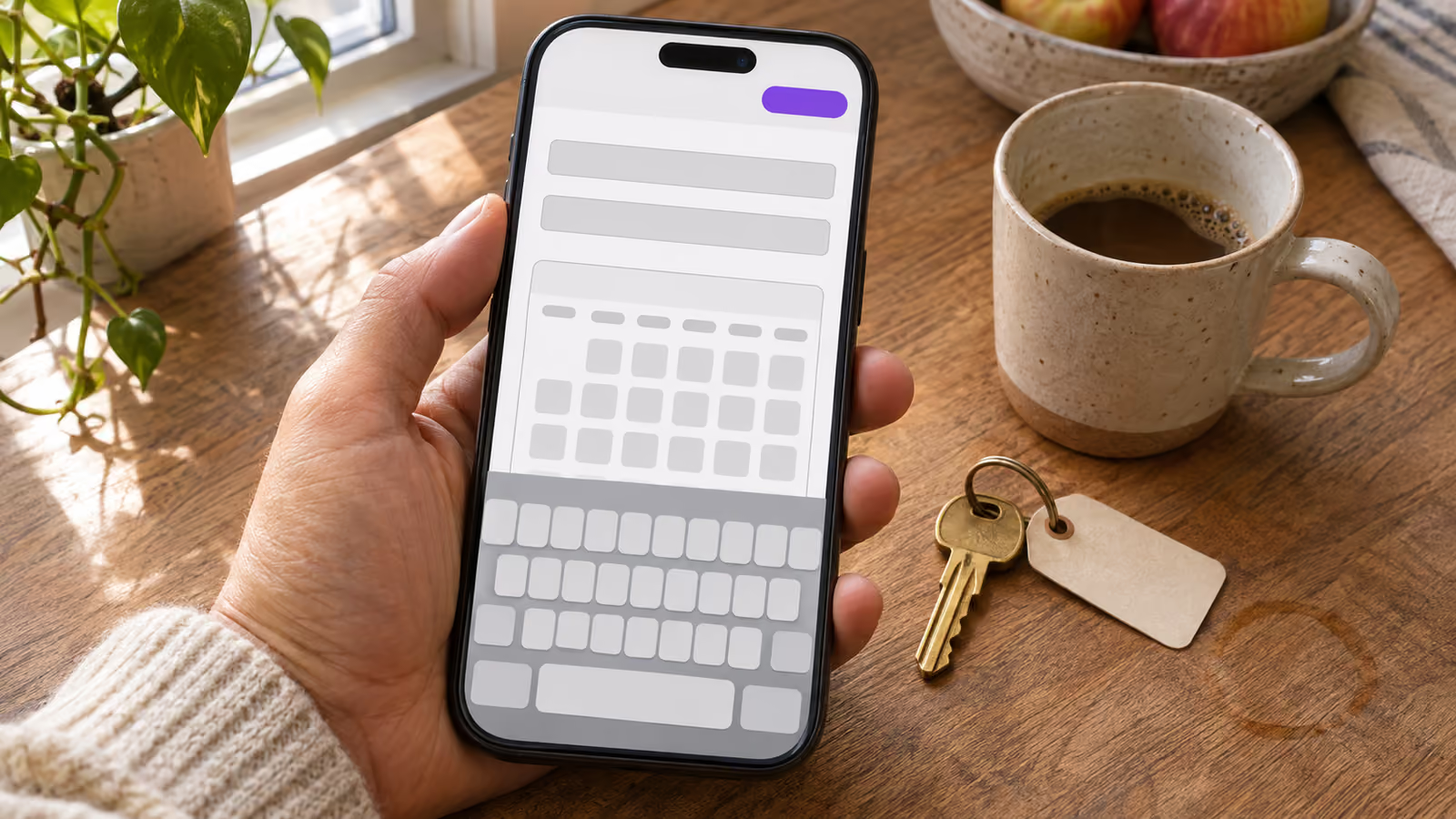
Your analytics show people visiting the booking page on their phones, and very few of them finish a reservation. The visits prove the page is being found. What they do not tell you is where people stop: at the dates, when the total appears, at the contact fields, or on the payment screen.
The quickest way to find out is to book your own property on your own phone, on mobile data, and write down the first moment you hesitate or have to fix something. That first stop is usually more useful than any general list of conversion tips, because it is specific to your form.
Where in the form are mobile guests giving up?
Split the booking into five steps (dates, price, guest details, payment and confirmation) and find the first step where your numbers drop sharply. Fix that step before touching anything later in the flow.
You can usually get three counts without new tools:
- Visits to the booking page from your website analytics, filtered to mobile.
- Started bookings, if your booking system records a reservation before payment.
- Completed bookings for the same period.
If many people visit and almost nobody starts a booking, the problem sits in the dates or the price. If bookings start and then expire unpaid, look at the payment step. BookBed's documented statuses work this way, for example: a new booking awaiting payment is Pending, a successful payment moves it to Confirmed, and payment expiration turns it Cancelled. A run of expired Pending bookings points you at the payment screen.
One limit to know before you set up tracking: if the form lives inside an embedded widget served from another domain, your own page's analytics script generally cannot read what happens inside it. Browsers restrict scripts from one origin reading a document from another, as Mozilla's same-origin policy reference explains. Field-level data then has to come from the booking tool itself, or from your own manual test.
What goes wrong at each step on a phone?
Four mechanical problems are worth checking first, because you can usually fix them yourself: a screen that hides the next action, a keyboard that fights the field, a price that changes late, and a payment step that sends the guest somewhere they did not expect.
Use this table as a diagnosis guide. Each row is something to check, not a proven cause on your site.
| Step | What the guest experiences | What to check on your phone |
|---|---|---|
| Dates | Calendar cut off or scrolls inside a box | Can you see the calendar and the next button without nested scrolling? |
| Dates | Sold night or too-short stay rejected only at the end | Does the form block invalid dates before the details screen? |
| Price | Total jumps after dates are chosen | Is the first total the one the guest will pay? |
| Details | Wrong keyboard, no autofill | Does the email field open an email keyboard and offer saved details? |
| Details | Error shown only after tapping Book | Does each field say what is wrong as you leave it? |
| Payment | Redirect to an unfamiliar page | Does the page say who is charging the card before the redirect? |
| Payment | Bank asks for approval in another app | Can you return to the browser and still finish? |
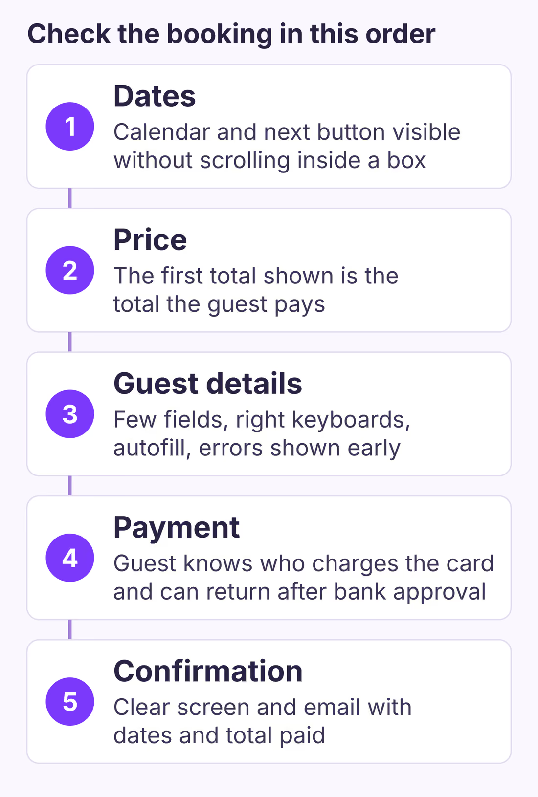
The diagram is a checking order, not a measurement. It does not show how many guests leave at each step on any real site; only your own counts and test can tell you that.
Dates: the calendar has to fit the screen
The date picker is the first thing a mobile guest touches, so it is where a layout problem hurts most. Embedded booking widgets usually sit in an iframe, and if the page builder gives that frame a fixed height, a phone shows a calendar inside a small scrolling box with the Continue button hidden below it. The guest tries to scroll the calendar, the whole page moves instead, and a guest in a hurry may give up there.
Check it on the smallest phone you can borrow. BookBed's own embed troubleshooting gives the fix for this case: raise the frame's min-height or remove a max-height restriction your site adds. Also check that a chat bubble, cookie banner or sticky header does not sit on top of the button you need to tap next.
Invalid dates belong at this step too. A guest who picks a sold night or a stay shorter than your minimum should learn it on the calendar, not after typing a name and email.
Price: show the stay total before the details screen
Once dates are chosen, the guest wants one number: what the stay costs. If cleaning or other mandatory fees appear only on the last screen, the total jumps at the moment the guest is deciding whether to pay.
Baymard Institute's checkout research is about retail rather than travel, but it is a useful signal: among US shoppers who abandoned a checkout for reasons other than browsing, 40% said extra costs were too high and 12% said they could not see or calculate the total up front. We infer the same mechanism can apply when a rental fee appears late. In the US there is also a legal side: the FTC fee rule covers short-term lodging, which our conversion rate guide explains in more detail.
Guest details: fewer fields, the right keyboards, early errors
The details screen is where phone typing becomes the obstacle. Google's payment and address form guidance on web.dev gives concrete rules that apply directly to a booking form:
- Remove fields you do not need to confirm the stay. The guidance is blunt: "Don't ask for data you don't need!" A home address, company name or "how did you hear about us" field can wait until after booking, or go.
- Use one name field. web.dev notes that a single name input "makes autofill simpler" than separate first and last name fields.
- Use the correct input types.
type="email"andtype="tel"bring up the matching keyboard on a phone, andautocompletevalues let the browser fill saved details. - Validate as the guest types. web.dev recommends validating data while it is entered rather than only when the form is submitted, so a mistyped email is flagged at that field instead of after the guest taps Book.
In the same Baymard survey, 17% of those shoppers said the checkout was too long or complicated and 18% abandoned because the site required an account. If your form makes a guest create an account before booking, test whether you can remove that step.
Tap targets matter as well. The W3C's WCAG 2.2 criterion 2.5.8 sets a minimum target size of 24 by 24 CSS pixels at level AA, with exceptions such as enough spacing between targets. Calendar days and guest-count buttons that are smaller than that and packed close together are easy to mistap on a phone.
Payment: tell guests where they are going and why
The payment step often moves the guest out of your page. With many hosted checkouts, including Stripe Checkout, the guest may be redirected to a payment page hosted by the processor. BookBed's widget works this way: its documentation says the guest is redirected to Stripe's secure checkout page to pay. That is normal, but it can surprise a guest who expected to stay on your site. A short line on your page next to the booking form, such as "Payment is taken on Stripe's secure checkout page and the charge comes from [your business name]," answers that question before it is asked. If your booking tool lets you edit text inside the form, put it beside the payment button as well.
The second surprise is bank authentication. Stripe's 3D Secure documentation explains that the guest's bank may ask them to confirm a card payment with a password, a one-time code sent to their phone or biometric verification, and that Strong Customer Authentication rules in the EEA and UK may require it. On a phone, this can mean leaving the browser to approve the payment in a banking app and then coming back. Test it with your own card: return to the browser after approving and check that the booking completes and that you see a clear confirmation.
If a payment fails or times out, decide what should happen to the dates. Our guide to failed direct booking payments covers when dates should stay held and when they should reopen.
A 15-minute phone test you can run today
Run this on a phone, on mobile data, in a private browser window, and write down the step number where you first hesitate, mistype or wait.
- Open your property page from a search result or a link, not a bookmark, and find the booking form. Note how many taps it took.
- Choose dates including a night you know is sold. Note where the form tells you.
- Choose valid dates. Write down the first total you see.
- Fill in the details. Note any field that opens the wrong keyboard, ignores autofill or shows an error only after you submit.
- Continue to payment. Check that the total still matches step 3 and that you know who is charging the card.
- Pay with a real card, complete any bank approval, and return to the browser.
- Check the confirmation screen and email, then cancel and refund the test booking and confirm the dates reopen.
The first step where you wrote something down is your first fix. Fix only that, then repeat the test. If the test passes and guests still leave, the issue is more likely price, reviews, trust or the traffic you attract than the form itself. Our booking page checklist covers the trust side.
When this advice does not apply
- Your traffic is mostly not looking to book. If visitors arrive from an unrelated blog post or a social link, a low completion rate may say more about the audience than the form.
- You take inquiries rather than instant bookings. In inquiry mode, the useful measure is how many inquiries you receive and answer, not completed payments.
- Your form sits on a platform you cannot change. Some website builders control iframe size or add overlays you cannot remove. Fix what you can and ask the builder's support about the rest.
- Your total depends on local taxes. Rules on showing taxes and fees differ by country and city, so check your own jurisdiction before deciding what the first price must include.
What to do next
- Run the 15-minute test on your own phone today and note the first step where you stopped.
- Pull mobile visits, started bookings and completed bookings for the last 90 days and compare them.
- Remove one field you do not need to confirm a stay.
- Add one line near the booking form saying where the guest will pay and who will charge them.
- Repeat the test after each change, and give each change enough visits before judging it.
For the bigger picture of adding a booking step to a site you already have, see adding direct bookings to an existing website.
Sources
- Google web.dev, "Payment and address form best practices". Verified 2026-11-02.
- W3C, "Understanding SC 2.5.8: Target Size (Minimum)", WCAG 2.2. Verified 2026-11-02.
- Stripe Docs, "3D Secure authentication" and "Build a payments page" (Checkout). Verified 2026-11-02.
- Baymard Institute, "Cart abandonment rate statistics". Verified 2026-11-02.
- MDN Web Docs, "Same-origin policy". Verified 2026-11-02.
About BookBed: BookBed's embeddable booking widget shows a unit's availability and takes the reservation on your own website, with card payments taken on Stripe's secure checkout page and paid into your own Stripe account. It does not bring visitors to your site or guarantee that they book, so run the phone test above after you embed it. Get the direct booking widget